
iOS app — AI strength coach
StoneUp
Build strength, stone by stone.
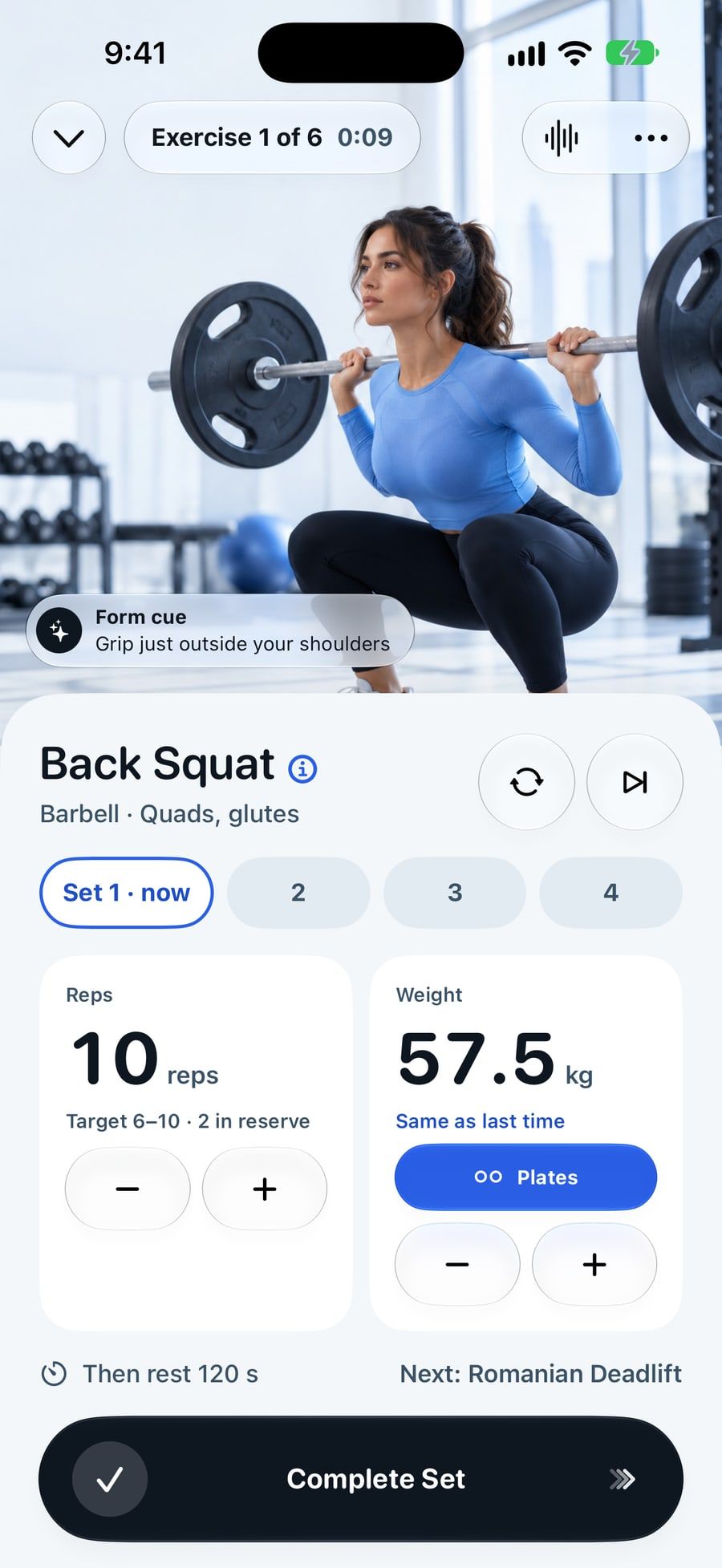
An AI strength coach for iPhone and iPhone Duo, designed for the gym floor: one-tap logging, a hands-free voice coach, and a plan that adapts every session and explains why. All on device, no account.

- 1tap to log a set, with undo
- 7one-tap questions build your plan
- 88automated tests, 4 of them VoiceOver
- 0accounts. Nothing leaves the iPhone
The brief
Not a video library. Not a chatbot.
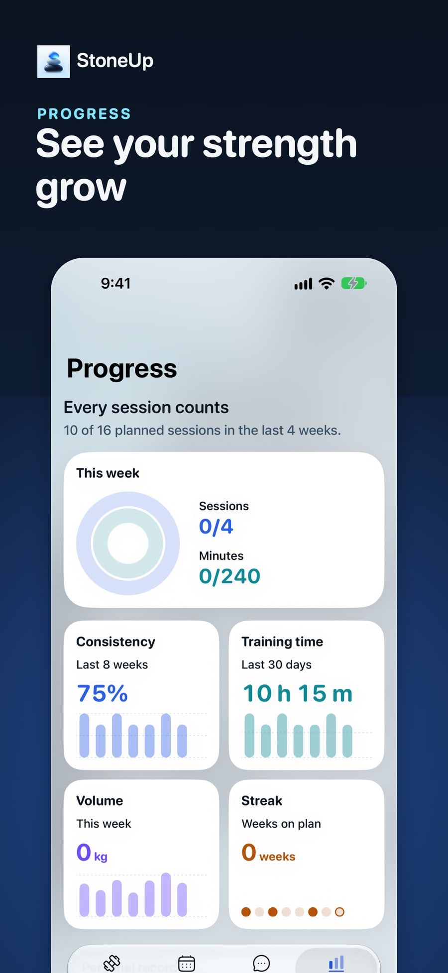
The product spec set one goal: help people actually show up, know exactly what to do, finish the workout with minimal friction, and see proof they are getting stronger.
The core loop
- 01Plan
- 02Show up
- 03Train
- 04Track
- 05Adapt
Who it’s for
Four people I designed every screen around
Sara, 29
An anxious beginner who needs to know exactly what to do next.
Omar, 34
Intermediate lifter on iPhone Duo who wants one-tap logging.
Lina, 41
Trains at home in 20 to 30-minute windows.
Khaled, 52
Returning lifter with an old knee injury, uses large text.
Design for the gym floor
Sweaty hands. Phone on a bench. Ten seconds.
Nobody uses a workout app the way designers test it. So every decision was checked against a glance between sets:
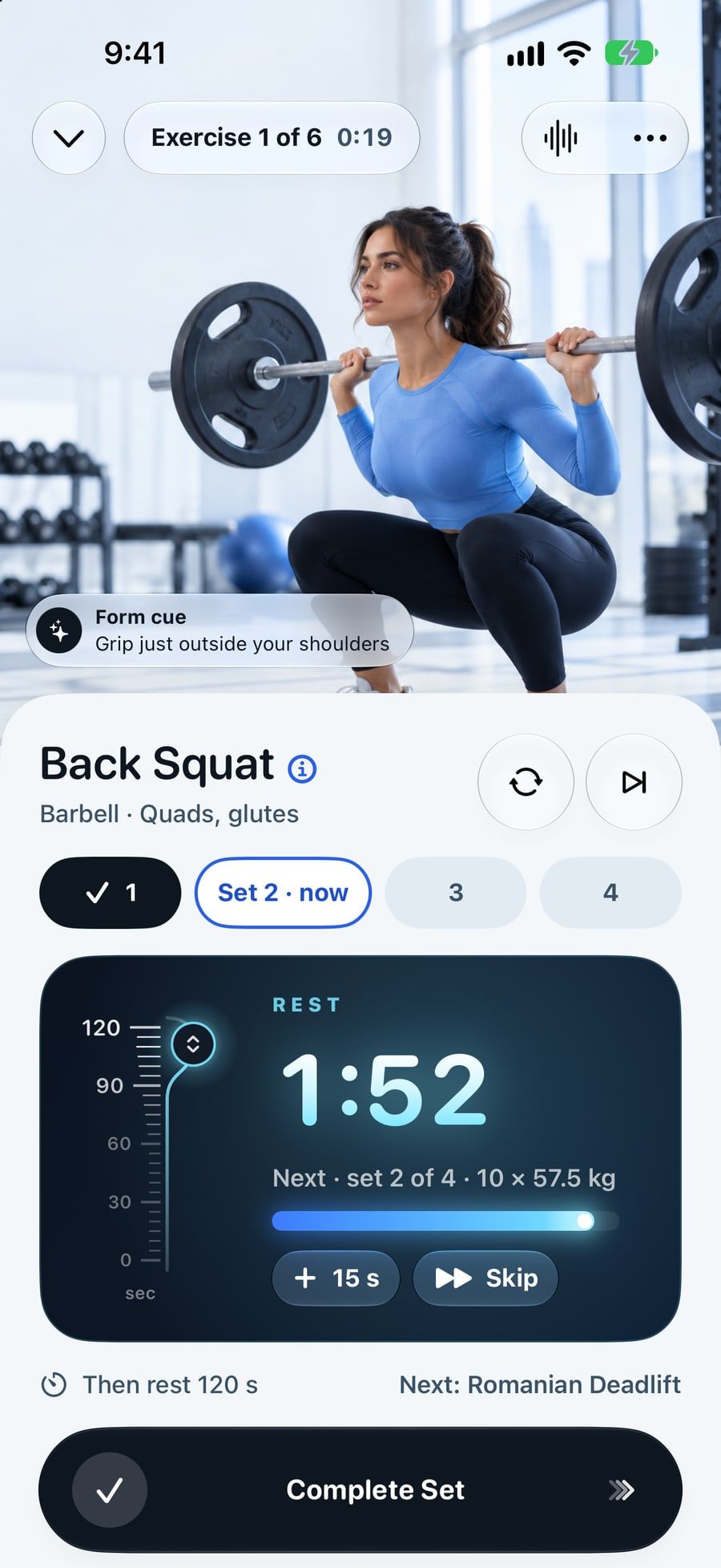
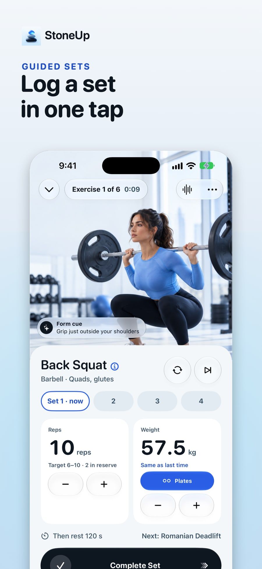
- One-tap set logging, with undo and tap-to-edit
- A rest timer you can read across the room
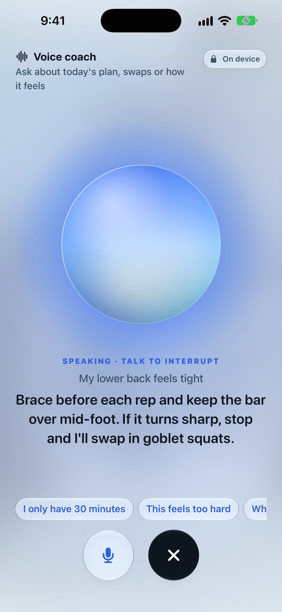
- Hands-free voice: “done”, “skip rest”, “what’s next”
- “Short on time?” trims a session to 20, 30 or 45 minutes
Explainable AI
A coach that shows its working
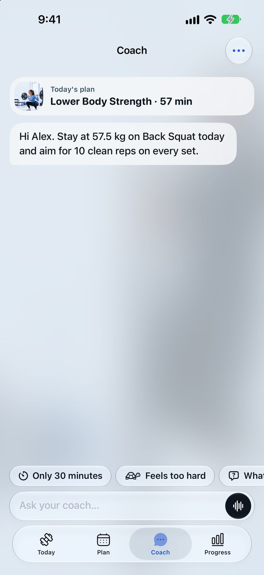
The on-device model only proposes changes as structured intent. Deterministic rules validate every proposal, and nothing touches your plan until you accept it.
Progressions come with one plain sentence of why: “Stay at 57.5 kg: last session felt hard.” Mentions of pain get a cautious answer, never a push.
Glacier UI
A design system that stays calm
Liquid Glass over cool photography, SF Pro Rounded for numbers that matter, and one blue accent. The voice: calm, concrete and encouraging, like a good coach on the gym floor. Never hype, never shame.
- Ink#0E1620Structure
- Glacier Blue#2A5FE6Accent
- Ice#7CE7FFEnergy, glow
- Snow#F3F7FABackground
- Frost#DCE7F0Surface
- Mist#93AEC4Neutral
- Ember#F5B266Achievement only
Naming
Kairn became StoneUp, and the metaphor became the product
The app started as Kairn, after the stacked stones hikers leave on a trail. It was hard to say, hard to spell, and a running app already used it. So two weeks before launch I renamed it.
The cairn stayed, as the Stone Stack: one stone per finished workout. The newest one glows blue and drops in with a squash and a haptic tap.
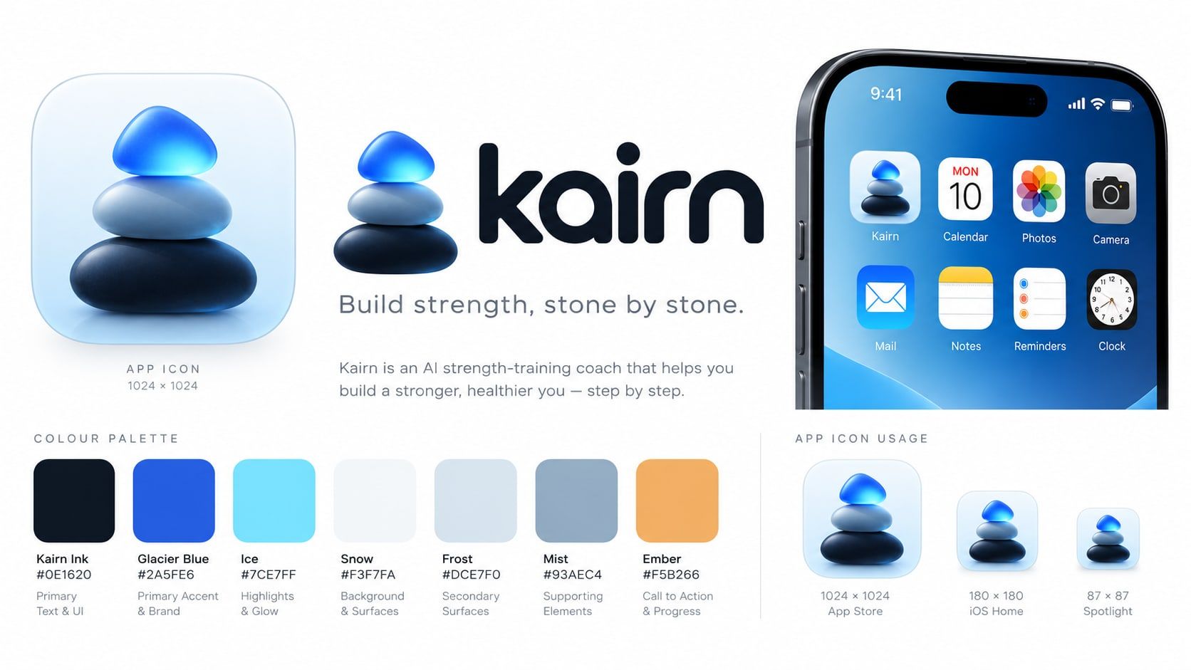
The Stone Stack: one stone per workout
UX audit
Nine findings, nine fixes
Before launch I audited the app against the four personas. Some of what changed:
Exercise guide sheet
Form cues one tap away, for Sara.
Undo toast and tap-to-edit
Mistakes cost nothing mid-set.
“Short on time?” chips
For Lina’s 20-minute windows.
44-pt targets and bold tab icons
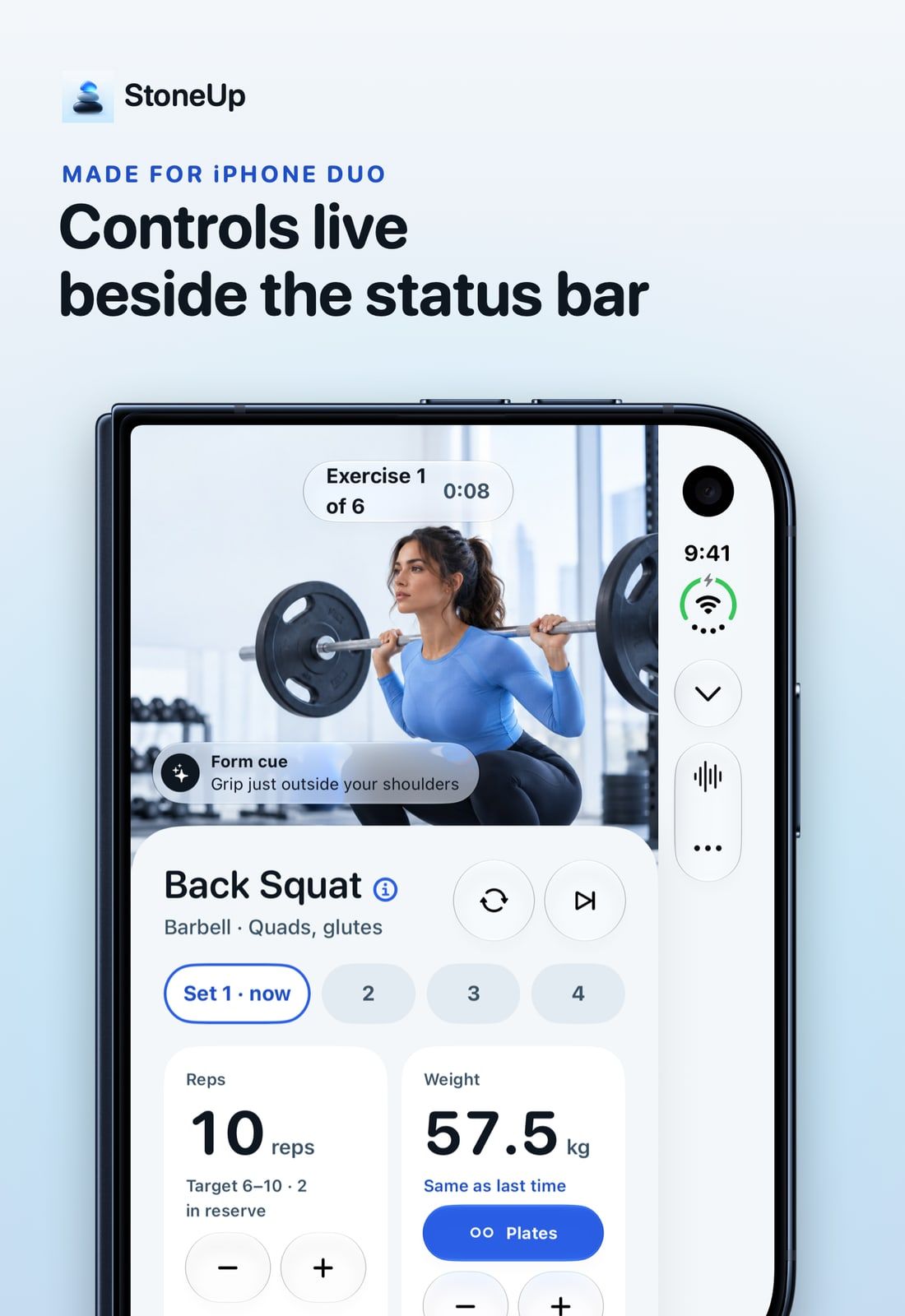
Readable in the Duo’s side strip and at large text sizes.
Rebuilt onboarding and Plan tab
After benchmarking Apple Fitness, Runna, Future, Fitbod and Centr.
Status never by colour alone
Plus Dynamic Type, VoiceOver labels and Reduce Motion.
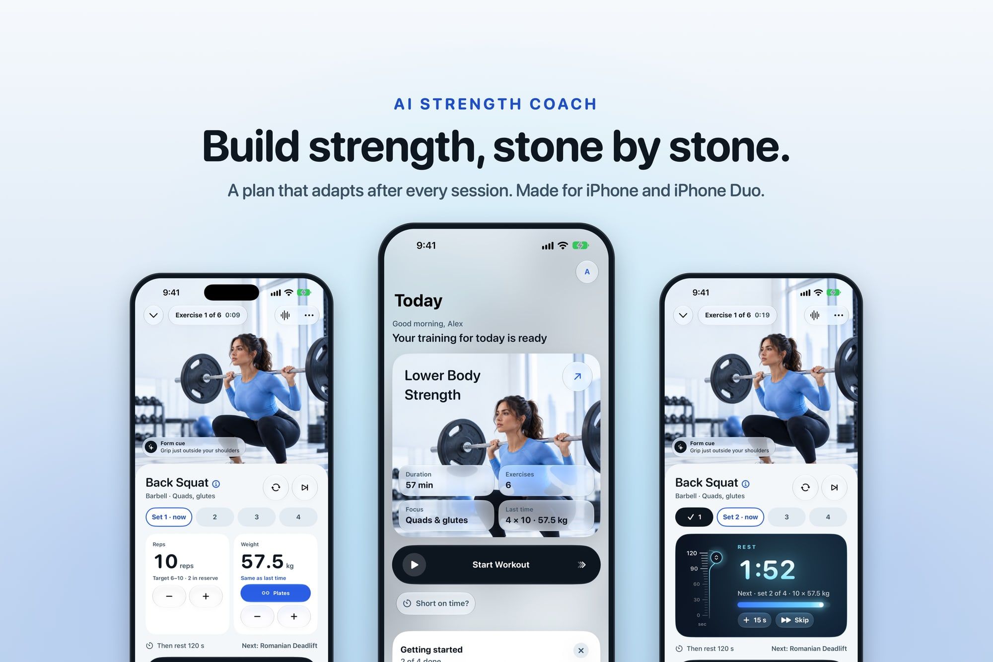
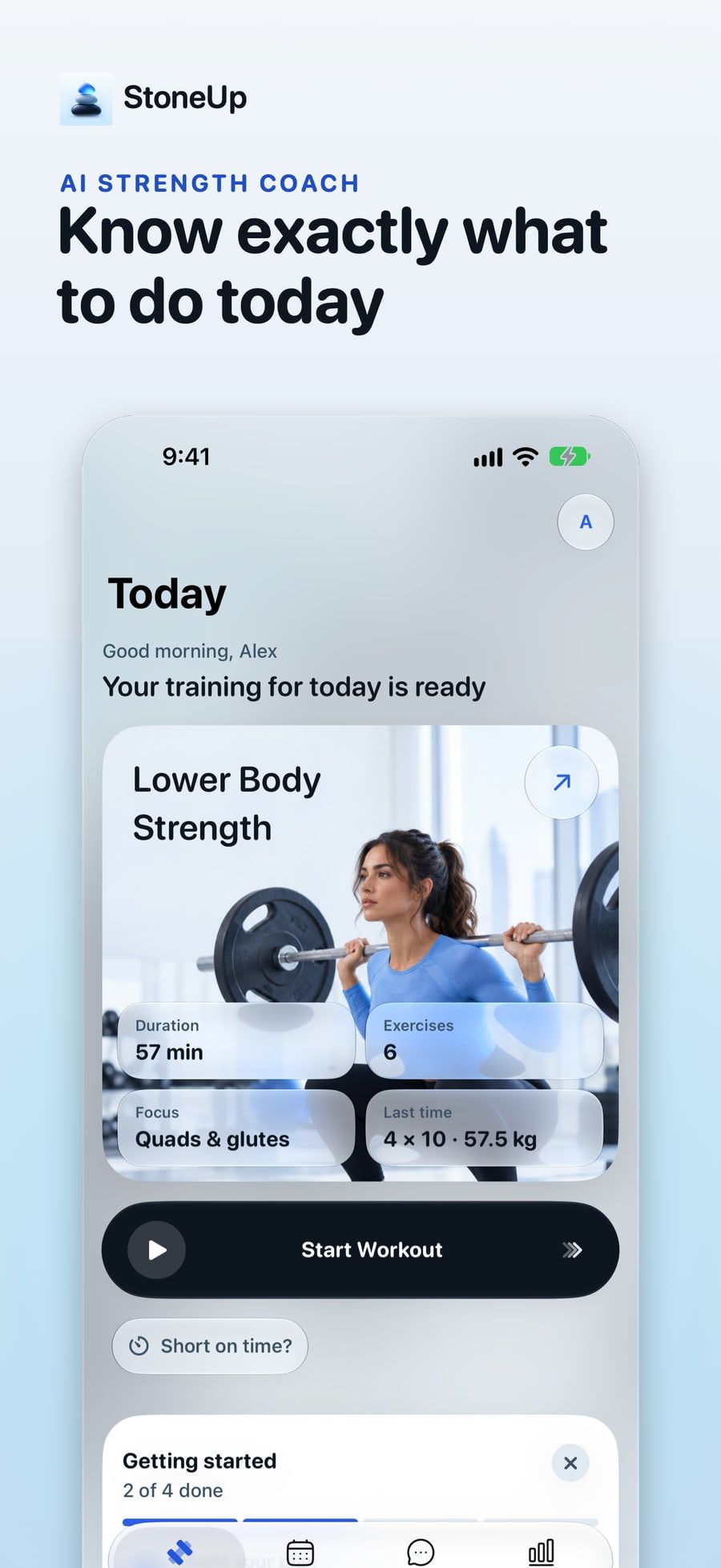
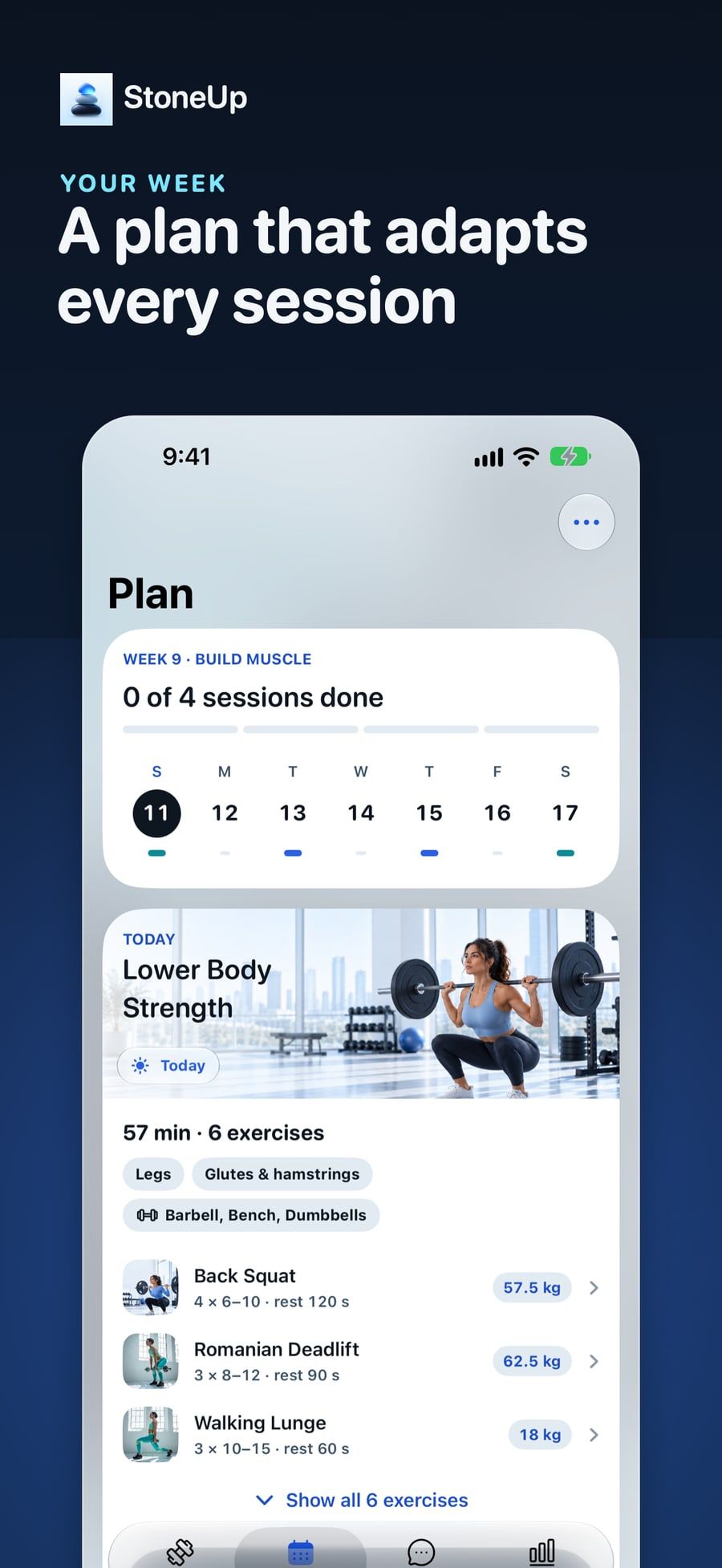
iPhone Duo
The fold becomes the divider
Unfolded, the workout splits in two: the exercise on one side, big controls on the other. Half-folded on a bench, it switches to a hands-free pose. The tab bar moves into the strip beside the status bar, and nothing is lost when you fold or rotate.
Built with
- SwiftUI
- SwiftData
- Foundation Models
- Speech
- ActivityKit
- WidgetKit
- App Intents
- HealthKit
- Swift Charts
- RealityKit
- Swift Testing
- XcodeGen
Launch
Launched with iPhone Duo
StoneUp launched free in 174 countries alongside iPhone Duo, with a featuring nomination, three custom product pages and a “Duo Launch Week” challenge event.